


Paint Pairing
Imagine if paint was lickable! With so many new delicate shades reminiscent of summer treats (yes like ice cream) we find ourselves really longing for new schemes, almost good enough to eat! Although we are not visiting Charlie & The Chocolate Factory, we are looking inside the delicious interiors created by our partners. We call it ‘Paint Pairing’, matching (or un-matching) wall colour schemes with our signature grosgrain trims, the perfect way to inspire your interiors this summer.
Pink to give you forty winks!

Gunter & Co Interiors called this master bedroom a ‘curveball’, because this unexpected shade of pink was not what they had in mind at first, but the light was dimmer than expected, being in a lower ground, and they decided to pick up a particularly soft but uplifting shade of pink. ‘Setting Plaster’ by Farrow & Ball was painted on the walls and paired with our signature silver grosgrain trim (available on our Heritage Collection), as our silver was designed to be particularly warm (unlike most silver) which tend to have a colder blueish tinge) and contains a hint of lavender and a hint of taupe, which just paired up beautifully with the subtle shade of ‘almost pink’ of Setting Plaster.

Slide Away with Me!
If this bedroom doesn’t make a child’s dream come true, then we don’t know what will. We love the ingenious way Louise Holt Design has brought the playground inside but also how the subtle shade of purple feels utterly gender fluid and would entice any little boy or girl to go to bed thanks to its cool and calming feel. This pastel purple paint (we believe, Hortense from the Little Greene Paint Company) has been paired with our Smoky Plum grosgrain trim from the best-selling Island Collection.
Little Greene Paint Company feature Child Safe Paint, which means these paints are free from toxic ingredients and are so safe for children’s rooms they can even be used to paint cots, furniture and wooden toys.
Keep calm & carry on!

Brady Williams Studios are known for their exquisite and timeless designs, and like many, they opt for the clean, crisp look with fine detailing, as seen in many of their residential projects. This twin room is a great reflection of their work, and a colour palette that we all feel ‘at home’ with. The detail seen below in our Classic Collection ties in perfectly the ‘piping’ theme seen on the throws, pillows and headboards. The Paint and Paper Library’s selection of timeless neutrals, such as Stone I and II are the perfect paint pairing with this bedroom.
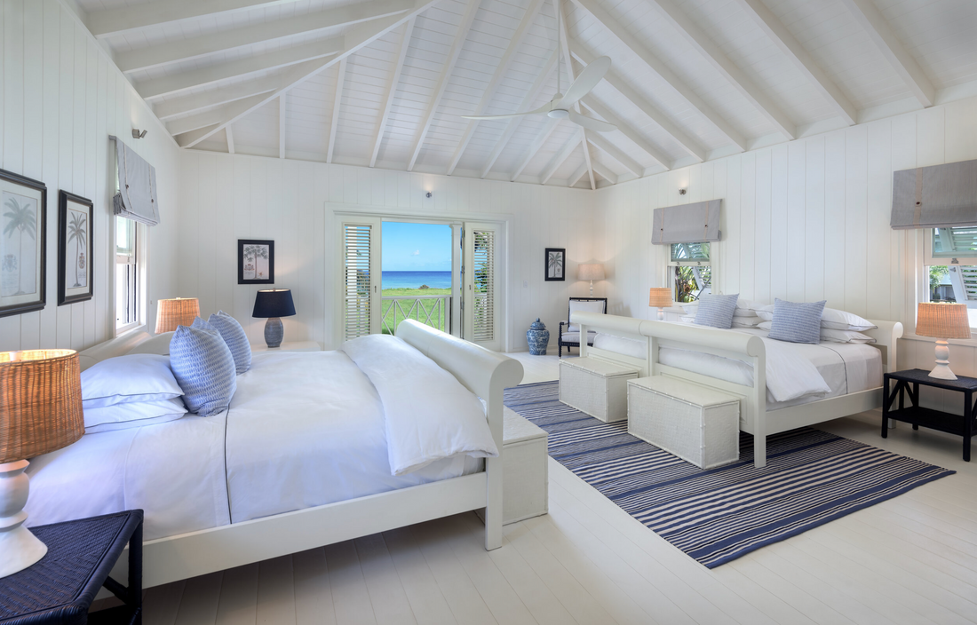
Bringing the outdoors, indoors
We wish we were waking up in the North Suite at The Great House Barbados. Imagine the sound of the sea, slipping out of cool crisp Island bedding and opening the door to the bright blue Caribbean beachfront. This five-star hotel features different colour themed rooms which were matched to our Island grosgrain trim. The bedroom walls are exposed brick, with a subtle wash of paint. For a similar effect, Lick’s Exterior White with grey undertones would make the perfect pairing for a tranquil room.
Would you like some more inspiration? Design tips? Or bespoke designs for your home? Contact our Bespoke Team to discover how you can pair your paint (and/or rooms) with London and Avalon.